**********************************************************************************************
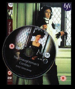
THE DRAUGHTSMAN'S CONTRACT R2 UK
The BFI (British Film blahblah) has issued the two Greenaway releases I mentioned on the last column. The first being Greenaway's breakthrough movie, "The Draughtsman's Contract", which though not one of the director's best (maybe because it concentrates too much on storytelling), is still suprisingly intriguing, and visually impressive (while suffering from the absence of the masterful Sacha Vierny, and the presence of 16mm, brought on by the low budget, which definitely does not suit Greenaway's style). Oh yeah, Michael Nyman's music is excellent (though not as great as in the other recent Greenaway release from the BFI).
The dvd itself is... well, maybe not brilliant, but mostly satisfying, yes. The feature is presented in anamorphic 16:9 mode slightly windowboxed in the OAR 1.66:1. While the image is what it is for 16mm (the extras state that the transfer was made from a 35mm blow-up - maybe using the original 16mm negatives would have been wiser?), it is an improvent over the ol' US Fox Lorber dvd, with better colors, and cleaner details, although the framing on the Fox Lorber transfer is slightly better; the sharpness could have been better, I'm sure. Accompanied by nice animated menus, first off is the excellent introduction by Greenaway, which illustrates the picture's evolution admirably. The restoration demonstrates how much the dvd transfer improves upon the previous TV and vhs masters (including the hideous early 1980's BBC transmission!). The deleted scenes are quite disappointing, as they are almost silent for the most part, and quite unintresting, especially because I have read that Greenaway cut huge chunks of material, and has even been rumored to be piecing it together to create a completely new feature picture! So maybe he's saving them for that, as all we get here is 4 scenes (presented in scratchy 4:3 full frame), clocking in at about 10 minutes, with the most interesting one being a scene featuring chairs being piled up everywhere at the command of the Draughtsman. The others being a rainy scene with the Draughtsman (which clearly was never fully completed, as you hear Greenaway's commands in the background!), a chatting with the lady of the house and the Draughtsman (in the bedroom, suprise suprise), and a mildly funny, well acted anecdote. Next up, the Guardian interviews Michael Nyman, which features few interesting details, but nothing more; especially the editing, which is mostly just one-take,zoom-in-zoom-out style, is really boring - it might have been mildly amusing in "Pink Flamingos", but doesn't cut it here. Why not putting pictures of Nyman or the movies to illustrate the interview? I wish Blue Underground's editors would have gotten their smeared hands on this. Still to go: a watchable (barely) gallery, and a link to the BFI's web content of "The Draughtsman's Contract", which the BFI included there over two months after the dvd had been released! The content includes the early rough draft of the script, and some notes made before the movie got "the green light", which are ok, and include a few fascinating details, which the dvd strangely never gets into (including that Greenaway originally wanted the movie to be shot in black & white!). Still, you would expect that the stuff would have been put into the web at least by the dvd's street date. Also, the access to the movie's press book in interactive form can be found hidden on the 'special features' menu (the dvd back cover states the disc includes "hidden features", but this is the only one I have managed to locate thus far). And last, Greenaway's audio commentary, which features a lot of sometimes fascinating historical info, the evolution of the script and shooting, and the actors. While well worth listening to, I would have hoped he would talk more about cinema, actually, and he does for a short while, providing one of the best moments in the commentary, when he talks about compositions, and how unfortunately little color has been used in cinema (Apart from one or two films, like Godard's "Pierrot le fou", who uses primary colours in a very very self-conscious way, I can think of a very few films that would actually consistently, frame after frame, as an entirety, use the actual language of colour as one of the organising principles). The rest is mainly extentions of the stuff covered in the introduction.
A ZED & TWO NOUGHTS R2 UK
The other of the recent BFI Greenaway releases is "A Zed & Two Noughts", Greenaway's follow-up to"Draughtsman". This has been a little of a disappoinment on the transfer side, while being brighter (maybe too much so), and cleaner than the US Fox Lorber dvd, it just isn't sharp enough, and sharpness is essential to the images in this work in my opinion. Presented in anamorphic widescreen 1.66:1 (16:9 with slight windowboxing), the framing also is inferior to the Fox Lorber disc, with some picture missing from the right side especially. The extras include Greenaway's introduction and audio commentary, trailers, and for some reason only an excerpt of about 7 minutes of the making-of featurette, which originally lasted over 20 minutes! How about putting the entire making-of featurette, and maybe Greenaway's TV short "Darwin", which I have wanted to see for a while, and that would have suited the disc perfectly considering the movie (let's all say it, folks: Darwin was a good stooooooryteller!).
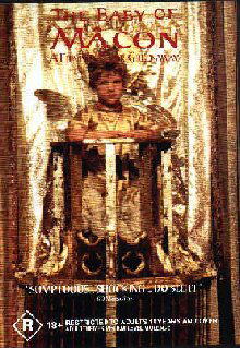
THE BABY OF MÂCON R0 AUSTRALIA
Also, let's yackity-yack about the only dvd release, thus far, of one of Greenaway's masterpieces, "The Baby Of Mâcon". The Australian dvd is unfortunately quite rubbish, but the only way to go for now: the British video is widescreen, but inferior in picture quality by nature, and the Japanese laserdisc, which is widescreen has pretty good picture quality, I hear, is censored. The Aussie dvd, which states on the back cover that aspect ratio is 4:3 full screen, really has an aspect ratio of about 1.78:1, instead of the original Panavision scope, but instead of cropping (some titles on the left might be left out partially due to TV overscan, however, and there IS a little visual data missing from the left side), it apparantly is anamorphic! But the disc does not have an anamorphic encoding, so you have to squeeze the picture yourself with the 16:9 mode button (if you don't have the feature on your set, though luck...). I viewed the feature in an aspect ratio of about 2.40:1; the shapes look about right, the compositions are very typical Greenaway of the period. The sound is ok for the most part, though a few spots inlude some crackle and pops (in a movie made in the early 1990's!!). The image is not nearly sharp enough (when even the dvd production house logos in the beginning of the disc are rubbish, you know you're in trouble!), and though some scenes look quite ravishing, some other parts are nearly VHS quality. The colors are quite bareble, though, and unfortunately some print damage occurs on a few spots. In short however, the transfer does little justice to Sacha Vierny's fantastic cinematography (ooooh man, I wish I could view a pristine 35mm of this in a big big theatre screen). There are ok interactive menus, and no extras.
THE BELLY OF AN ARCHITECT R1 US
The dvd review of the US MGM dvd of "The Belly Of An Architect" several days before the dvd's street date. Is ATTIC great or what!
The movie concerns itself with Stourley Kracklite (don't you just love those Greenaway names), played by the terrific 'n' underrated Brian Dennehy, an American architect who comes to Rome to curate an exhibition of a little-known but visionary architect Etienne Louis Boullée (a real-life figure by the way, who originally wanted to be a painter, and included many painterly effects to his architecture designs). In the course of the visit, both his life and health fall apart. The result is quite fine, though maybe not top Greenaway. The visuals created by Greenaway and Sacha Vierny are terrific (as anyone can tell just by looking at the pic on the dvd cover). Michael Nyman did not participate on the music, but the score by Wim Mertens is remarkable (you just try to whistle many of the tunes heard here!).
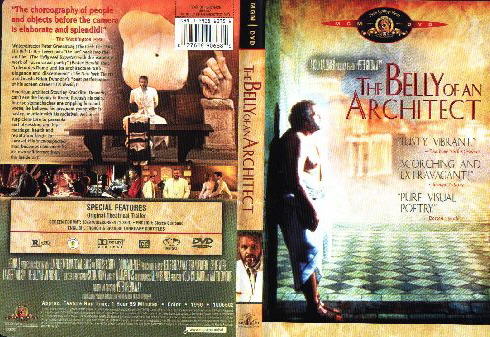
The movie is letterboxed anamorphically in the aspect ratio of 1.82:1. Now, I've always thought that "Belly" was shot at 1.66:1, although I am not a hundred percent on this. Still, the movie's pervasive symmetrical compositions looks quite ok. The image has some grain to it, which doesn't bother too much though (this happens too much on the dvds of the movies made in the 1980's, maybe the distributors think they're not that old, so they don't require any restoration what so ever!); I could not detect any scratches, or compression artifacts. The movie is supposed to be fully uncut (the only Greenaway movie that for my knowledge has been censoredor cut in the US is "The Cook The Thief His Wife & Her Lover"), and the program clocks in at about two hours (NTSC), which is pretty odd, concerning almost all video guides and so forth list the running time as 108 minutes, even the sublime (isn't that a funny word?) "Virgin Film Guide"! Well, the more the merrier, right? Right...?
Only the non-noteworthy theatrical trailer is included in the extras (not even a small booklet is contained inside!). Sure, the cover sleeve boasts the "proof of purchase" rubbish the Americans seem to be so proud of (especially that GeorgeW. Bush Junior cunt), but what about proof of quality? Oh, ney! NEY...! Ok, maybe this's gettin' a little too operatic. 1, 2, 3, 4, ...
LES CARABINIERS R0 US
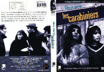
ATTIC celebrates the 41st anniversary (yay...!) of Jean-Luc Godard's 1963 movie "Les Carabiniers" by giving the dvd release a investigative journalistic journey of analyzing criticism foray-- ok... a review. The movie which was completely trashed by the critics and the public when released, concerns war. Few riflemen arrive at the shack of two peasant couples, and the recruit the men for fighting for "The King". The men, when given promises of pillaging, killing innocent people, and riches etc, accept and happily go to battle. This isn't a very narrative picture, so what follows is merely citations of endless postcards sent by the soldiers (who's names by the way are Ulysses and Michelangelo...) to their wives, and little absurdly funny episodes and fragments of their "adventures", which contains them humiliating people by gunpoint, and shooting helpless old grannies and mumbling absurd "macho" one-liners, plus real footage of warfare. Then they finally arrive home with their "riches".
The main theme in here, as most critics seem to feel, is war, and the insanity and whatever of war, but I actually feel that it is consumerisim. Surely has war is a big part of it, but it is more like presenting war as a milieu in my interpretation. Definitely its presentation of war as demeaning to the oppressed and their oppressors is original / interesting, but the consumerism aspect surely is stronger. The riflemen go to the war in order to get the material "goods" and finally (in the infamous "postcards" finale) they get only the concept of material goods - a statement on the true superficiality and shallowness of a consumerized society, and playing out war as the milieu is also good to draw parallels between these two factors. Godard's direction is his usual self-conscious self (though I prefer that to many contemporary cinemakers, who are almost self-consciously self-conscious, or in another words, vain). The frame shakes, and moves around a lot, and don't look for any great compositions either (although I am not a great admirer of this approach, I take it any day rather than any Dogme-95 crap). Many times Godard draws attention to many spots by repeating them many times from different angles. This I did not find brilliant, but interesting, yes. Raoul Coutard's cinematography is also quite satisfying. While certainly not a master like Sacha Vierny, Gianni Di Venanzo (or Freddie Francis for that matter), he certainly is a very good lenser. For some of his more publicly acclaimed work, check out Godard's colorful "Le Mépris" ("Contempt") (Criterion's dvd transfer is supervised by Coutard himself!) and "Pierrot Le Fou". "Carabiniers" on the other hand is very bl(a)(e)ck & white, and it suits the content quite well. I have many times expressed my disappointment on how little color is taken adventage of in cinema, but I have to say I think I know ever fewer pictures that take use black & white in any good way, or where it even fits the context (I definitely think that if you use color, you should take advatage of all of its possibilities, but if you don't want color, I much more recommend "color tinting", which they used in the silent era, rather than black & white. In tinting, the entire frame is presented in one color only, for example first red, then blue etc... check out "Häxan" [available on Criterion dvd] which uses the tinting process very well. Also comes in mind the watchable expressionist silent film "Waxworks", where the tinting effect is almost intoxicating): Fellini's "8 1/2", and maybe Eisenstein's fabulous "Ivan The Terrible"... The most powerful thing in the flick is actually the music in my opinion, which is truly right on target. It sounds like it's played on a a rusty old organ (and I don't mean Marienbad rusty, I mean RUSTY), and it perfectly adds the final layer to the grotesque modern folk tale-like ambience that the work has. Like in "Le Mépris", made in the same year amazingly enough, the same music plays many many times (in "Le Mépris", the brilliant Georges Delerue tune in the movie plays in about every single sequence!), but never seems to get boring. Maybe not a masterpiece, but well worth watching.
The feature is presented in the full screen format only, as they say at dvdlaser.com, and it was the way it was shot. The dvd producers did a fine job cleaning the image out of imperfections, but Godard originally intended the image to be much more grittier and grainier (just as the real footage of war in the movie) than it is here. It is fascinating how new digital restorations can sometimes have a negative impact on a movie, like some old movie which is restored to look better than ever and the special effects now look fake, when they looked quite believable before! Or it is always possible that the tools eliminate imperfections which were originally intended to be in the movie a'la "Les Carabiniers", or something that naturally belongs to the movie is eliminated when it is mistaken for imperfection ("Citizen Kane"... Did somebody say "Citizen Kane"...?). The result is fine, I guess, but I sure would like to view the French dvd (no subtitles there - sorry folks) to find what the image is like in that transfer.
The extras have Filmographies for Godard and one of the actors, which only contain the so-called (by me, anyway) "IMDb routine", as usual for Fox Lorber. The main attraction here is the "mini audio commentary" by critic David Sterritt. This means that various selected scenes (totalling about 16 minutes) play to Sterritt's mostly unrelated comments, which basically examine what the film is and what are its strategems. While many of analyzing is fascinating ("Les Carabiniers" being Godard's version of the classic Hollywood genre of the war movie, such as "A Bout De Souffle" was of the gangster movie), and a few behind-the-scenes info is great (the postcards were based on letters written by real soldiers in various wars, believe it or not), it's mostly his own self-indulgent thoughts, that I did not relate towards very much. Maybe Sterritt finds it interesting, but I don't. Next up, weblinks, which is not just the location of the web-site of the distributor, but real locations for the web-sites concerning the movie and its makers, as usual for Fox Lorber (see? I used it in a positive context!). There's also a short "About This DVD" section, which features some info about the dvd production (the history of the video transfer, mostly) and the dvd credits!
The ATTIC Webmaster
**********************************************************************************************
/ A-B-C / D-E-F / G-H-I / J-K-L / M-N-O / P-R-S / T-U-V / W-Y / # / MPAA-U/C /

You can use anything in this page for selfish purposes. The covers taken from The Finnish Cover Archive are used with permission.